
In Search of Alien Fish
“The truth is out there” is the tag line of the The X Files. It had a dual meaning 1) The truth exists independently of our knowledge of it, but it is “out there,” waiting to be discovered and 2) In the world of The X Files, it is also “out there,” as in mysterious and bizarre. This past Easter weekend I thought I stumbled into an episode of that 90’s sci-fi television series!
I had a fairly straightforward – if a bit too ambitious – agenda for my three days off: organize my fishing tackle for my first kayak trip of the year, do a little work on the upcoming album, write a blog post about either the unreliability of the various COVID-19 models or some damage-minimizing investment strategies for this Black Swan event, and have Easter dinner with the family. Instead, I made the innocent mistake of taking a cursory look at the fever data from the Kinsa website, which I mentioned in my last post[1]. I thought I’d take a second to peruse the charts to see if I could use Kinsa’s information to determine the efficacy of the states’ social distancing orders. Within minutes of starting my research, however, I found myself drawn, like Fox Mulder, into the bewildering implications of the Kinsa numbers.
Before I get into what I found there, let’s review the company and the temperature records they’ve collected.[2]
The San Francisco-based health technology company was launched in 2012 to help stop the spread of infectious illness — in particular, the seasonal flu — through earlier detection and earlier response.
Their means? An internet-connected smart thermometer, paired to a mobile app, which aggregates consumers’ temperature and symptoms data.This real-time data enables Kinsa to track where in the U.S. the illnesses start, so the health industry can be better prepared to mobilize the right resources in the right places at the right times.
Now, Kinsa says, the data gathered from its smart thermometer could help to predict future COVID-19 outbreaks by relying on the data it has collected for years to determine what the U.S. can expect from a normal cold and flu season. The model takes what is currently being seen — a spike in illness — and subtracts the “norm.” What they’re left with is an anomaly, which can be correlated to coronavirus.
Kinsa currently has thermometers in more than a millionhouseholds. More than 2 million users nationwide record about 150,000 temperature readings per day. Thermometers cost about $40 for a standard model and about $70 for an ear model. The thermometers connect to a smartphone via Bluetooth, uploading location, temperatures and user-inputted symptoms to Kinsa’s database. The result is a trove of information for the company to then mine for patterns.[3]
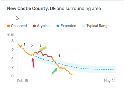
Keep in mind that what Kinsa records are the number of recent fevers compared to previous years’ information. These fevers can come from a variety of illnesses: seasonal flu, stomach flu, sinus infections, other bacterial infections, and COVID-19. The pattern in New Castle County DE is representative of jurisdictions coast to coast:[4]
- Beginning on 2/15, there was a consistent decline in fevers, probably from the normal unwinding of the seasonal flu.
- On 3/1, this decline abruptly stopped and the number of fevers began to rise into an “atypical” range, probably from the coronavirus.
- This rise crested on 3/8.
- The number of fevers then declined to an abnormally low level on 3/28 and continued to decline thereafter.
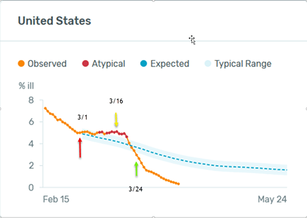
The overall U.S. pattern is very similar:
Kinsa doesn’t aggregate the data by state; it is presented county by county, so I pulled up the chart for the county in each mainland U.S. state with the most populous city, figuring that was a decent proxy for the whole state.[5]
I started my casual perusal in Maine, and worked my way down the East Coast, eventually covering the whole Lower 48. Every jurisdiction looked something like New Castle DE. This was not unexpected. We know that Farr’s law says that epidemics have a rise, peak and fall, that the coronavirus adds to the fever rate, and that social distancing drives down the incidence of illness for both COVID-19 and the seasonal flu.
What startled me, however, and made me long for a Dana Sculley to help me with the analysis, were the starting dates for the jump in fevers.[6]
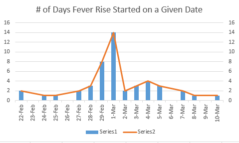
They clustered right around March 1st, with 14 of the 46 jumps beginning on that day,[7] and 36 of the 46 occurring between Feb. 27th and March 4th. I thought I was looking through a radio telescope at the cosmic microwave background radiation, which fills all of space uniformly throughout the universe.[8] Or perhaps aliens had dropped corona bombs over every state in the Union almost simultaneously. I rejected this tin-foil hat explanation, and begin trying to fathom an answer, using what we actually know about this virus and viral epidemics in general, with a few necessary assumptions included. Here are the first two explanations I considered:
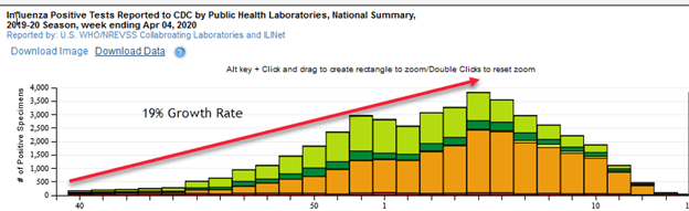
- A Rapid Spread From a Handful of Infection Points – Even though we don’t yet know the R0 for COVID-19 (the rate at which it spreads), early estimates for it were between 2 and 3; each infected person infects that many other people. Let’s assume it was 2.5.(The seasonal flu R0 is 1.3)[9] In that single day between 2/29 and 3/1, the number of fevers in the U.S. increased by 32,000, most of them likely caused by the coronavirus. Let’s also assume there were 10 people who came to the U.S. from China and Italy and got the ripples started. Believe it or not, if each of those initial infection points had come to the U.S. on 2/22, and the R0 of 2.5 had worked its devilish magic each day without a hiccup, new corona fevers would have equaled around 32,000 on 3/1. I think this is highly unlikely: it assumes that all the people in the U.S. are as perfectly connected to each other as the water molecules in a small pond, which is obviously not the case. According to the CDC[10], the seasonal flu, with its R0 of 1.3, had a compound growth in cases of 19% per week beginning on the first of October (166k cases) to its peak in early-February. If you double that rate for the coronavirus, it takes you 25 weeks from a starting point of 10 cases to get to the 32,000 new fevers on 3/1. This pushes those initial 10 cases back into late August. This is also highly unlikely.
- An Almost Simultaneous Entry of a Large Number of Infected Foreigners Into Almost Every County in the Country – Here is just a sampling of the initial day’s jump in fevers from disparate locations[11]:
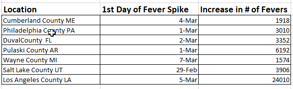
Pick almost any county you want – rural, suburban and urban — and the numbers and pattern look very familiar: sometime between late February and early March, they all experience a jump — sometimes a double jump — that interrupts the normal decline in fevers. If one individual started the contagion in Cumberland County, and we use a 38% increase per week in the number of infected individuals, as I did in the previous example, it means it would take 22 weeks to get to that 1,918 person jump on March 4th. Starting with 5 individuals in Philly takes 21 weeks to get to 3,010. In L.A., assuming a 33 person initial infection, you get to 24,010 in 21 weeks. We have many visitors from China and Italy, but they did not all drop into such widely scattered locations around the same time. (I didn’t pick those initial infection numbers randomly; Philly has 5x and L.A. 33x the population of Cumberland.) This explanation is also highly unlikely.
None of this made much sense, but as I wracked my brain for hours trying to come up with a plausible solution for this simultaneous, coast-to-coast explosion of atypical fevers, an idea began to emerge. Though I never got a chance to get my fishing tackle organized, my Fox-Mulder-like instincts led me to think about fish.
Imagine for a moment a large lake. Let’s call it Lake Washington. The lake is home to various species of native fish. The predominant species is the Flu Fish, but there are also a few other species of the genus Bacterium Infectio, commonly known as Snot Fish. Each year both the Flus and the Snots start their breeding in early October, begin to die off in early to mid-February, and by the end of April are almost non-existent. One thing all these native fish have in common is that, once they are done with their breeding, they spend the rest of their lives jumping out of the water. From a distance, the Washington Lake dwellers can’t even tell the difference between the varieties, but they know the fish are there because they jump, and their life cycle follows this same pattern each and every year.
In 2020, from early February through the end of the month, the population of jumping Flus and Snots declined as it always does. But then on March 1st something strange happened: the number of breaching fish stopped declining and abruptly began to rise. The Lake Washington folks were perplexed. They were even more puzzled when they called friends at neighboring lakes, all of which are connected to each other and to Lake Washington via small streams, and found out the same thing was happening everywhere! They decided to shock the lake with an electric current, to stun the fish so they would float to the surface.
What they discovered was that there was now an invasive species in all the lakes – the Corona Fish! Some imbecile introduced them into a number of lakes in early December. Though this fish looks something like the Flus and the Snots, it is distinguished by the fact that a large proportion never jump. But both the jumpers and the non-jumpers breed, and they had been doing their courting and birthing since early December, unnoticed under the lake’s surface. The jumping Coronas had been part of the breaching show since their introduction, but their small initial numbers didn’t cause the normal pattern to change, so no one noticed them. It was not until March 1st, when the population of Flus and Snots declined to a point where the rising number of jumping Coronas altered the pattern, that anyone realized something extraordinary was going on.
I’ll end this little parable there, but I think most of the connections to our current situation are pretty clear. The fish that jump correspond to people with fevers, and the non-jumpers are the asymptomatic COVID-19 cases. To help you visualize it, here is a chart:
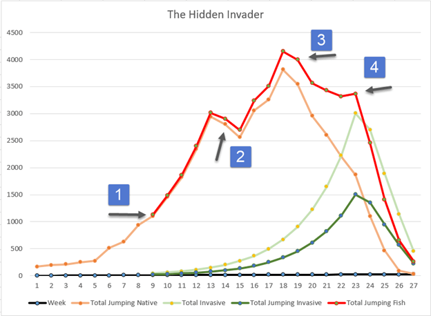
The brown line represents all the native fish, light green is the total number of invasive Corona Fish (jumpers and non-jumpers), dark green are the Corona jumpers, and the red line is the total of all jumpers (Coronas plus Natives).
- The Corona Fish are introduced in early December (week 9).
- In week 13 they are making a contribution to the number of jumpers that is visible on the chart, but the lake folks don’t look closely because the seasonal pattern hasn’t changed.
- Corona jumpers are making an even larger contribution to the total number of jumpers, but still no one notices because the normal progression continues.
- The pattern changes at the beginning of March, and everyone scrambles to figure it out.
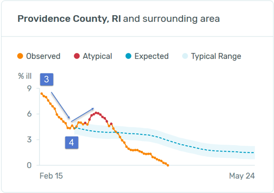
This sequence matches what has been typical in almost every jurisdiction in the country, as you can see from the Providence Rhode Island chart, where the period from 2/15 to 3/1 corresponds to the stretch between 3 and 4 in The Hidden Invader.
Are these numbers made up out of whole cloth? Where did I get them? What assumptions did I use?
- The “Total Jumping Native” figures come from the CDC website[1] which charts the number of 2019-20 flu cases in the U.S. From October to their peak in February, they grew at a 19% compound weekly rate.
- For the Corona Fish, I assumed a rate double that of the flu – 38%.
- I assumed that 50% of the Corona Fish were non-jumpers (asymptomatic). There have been a handful of random tests that have been done so far, with numbers in the 20%-80% range for asymptomatic coronavirus cases.
- I started the Corona Fish invasion at the beginning of December. There is mounting evidence that the disease was here before China let the world know about its existence. It is possible that California got it early had developed a degree of “heard immunity,” as their deaths are much lower than what was initially expected, and the state’s fevers never moved into the atypical range. Victor Davis Hanson has an excellent article on California[12], which also details his personal experience with some of the hysterical and virulently political attacks that many “journalists” engage in when they should be soberly covering this public health crisis.
- I assume that most of the spike in fevers has come from the coronavirus.
- I started with 45 Corona Fish being introduced into the lake. (Multiply the numbers in The Hidden Invader chart by 1,000 to get the real-life figures.)
You might question my assumptions about the growth rate, the number of initial Corona Fish and the asymptomatic percentage. Changing them will change some dates, but not the basic shape of the curve. For example, if you lower the growth rate or the number of initial infections, it pushes the expected introduction of the Corona Fish back without changing the pattern or the date of the rise in jumping fish.
Bottom line: The jump in fevers in the time period 2/28 to 3/4 is almost certainly attributable to COVID-19. However, that doesn’t explain their simultaneous rise in almost every jurisdiction in the country and, given what we know, neither does a starting point of a few infected individuals, or the notion that the virus parachuted into all states at the same time. It is most likely that the disease hit the U.S. earlier than expected, perhaps in early December, and that a large percentage of those infected are asymptomatic. This implies that the disease is more prevalent than currently estimated, which means that it has a lower mortality rate. It also implies that a significant portion of the sickness and deaths that have been attributed to the seasonal flu for the last few months were caused by the coronavirus.
This makes sense to me, but time will tell if my conclusions are just an alien fish story!
Don Harrison
The information contained in this report does not purport to be a complete description of the securities, markets, or developments referred to in this material. The information has been obtained from sources considered to be reliable, but we do not guarantee that the foregoing material is accurate or complete. Any opinions are those of Don Harrison, and not necessarily those of Raymond James. Expressions of opinion are as of this date and are subject to change without notice. There is no guarantee that these statements, opinions or forecasts provided herein will prove to be correct. Investing involves risk and you may incur a profit or loss regardless of strategy selected. Keep in mind that individuals cannot invest directly in any index, and index performance does not include transaction costs or other fees, which will affect actual investment performance. Individual investor’s results will vary. Past performance does not guarantee future results. Future investment performance cannot be guaranteed, investment yields will fluctuate with market conditions. The S&P 500 is an unmanaged index of 500 widely held stocks that is generally considered representative of the U.S. stock market. Forward looking data is subject to change at any time and there is no assurance that projections will be realized. All investments are subject to risk.
[1] http://capitalistinvestment.com/2020/04/updated-numbers-and-extraordinary-data/
[2] All the assumptions assume that Kinsa’s data is reliable, and that their samples are large enough to accurately extrapolate to total population numbers.
[3] https://healthweather.us/?mode=Atypical
[4] All similar charts from https://healthweather.us/?mode=Atypical
[5] This worked well; the charts within each state are very similar.
[6] Chart data taken from https://healthweather.us/?mode=Atypical
[7] I only worked with the lower 48 states, and Nevada and California never had a rise in fevers.
[8] The cosmic microwave background is faint electromagnetic radiation that fills all space evenly. It is generally considered to be a remnant of the earliest universe. https://en.wikipedia.org/wiki/Cosmic_microwave_background
[9] https://www.livescience.com/new-coronavirus-compare-with-flu.html
[10] https://gis.cdc.gov/grasp/fluview/fluportaldashboard.html
[11] https://healthweather.us/?mode=Atypical
[12] https://gis.cdc.gov/grasp/fluview/fluportaldashboard.html
