
Updated Numbers and Extraordinary Data
(I probably should have said this a few posts ago, but I am happy to hear from anyone who has corroborating or contradictory information, as long as the discourse is civil.)
In trying to further our understanding of COVID-19 and the effect of the disease on our collective economic and physical health, I have filled a 24 page Word document with links to various articles and sites that I have read and thought were helpful, in addition to reading a significant amount of material which I have discarded for unreliability, political bias, etc.. For the past week my reading has led me to questions which have exploded into rants:
- Why are we placing so much emphasis on “confirmed cases” when these numbers reflect the amount of testing being done and not the actual number of cases???!!!
- Why are policy makers relying so much on the wildly shifting forecasts of opaque models to try to determine the spread and lethality of the disease, and develop effective responses, while ignoring real world data – the Diamond Princess, the random testing that Iceland has done, the implications of the different paths that Japan and Korea have taken regarding masks and testing, etc.???!!!
- Who was the genius who first said masks won’t keep you from contracting COVID, but they will keep you from spreading it, and then advised that it made no sense to wear masks???!!! (Think about that for a minute, understanding that many of the infected are asymptomatic.)
- Why is the United States “liberalizing” the definition of a Coronavirus death, eliminating any attempt to distinguish between dying “with the virus” as opposed to dying “from the virus,” when it is vitally important that we have accurate numbers to shape current and future policy???!!!
I could go on and on, but I think it is more productive to focus on updating you on some numbers, and also alerting you to an extraordinary web site whose data has profound implications for the way we are combating this virus.
Downward Sloping Increase in Deaths and the Stock Market’s Rise– From my first posts regarding the pandemic, I have avoided models and insisted on basing any conjecture regarding future cases and deaths on real world data, using transparent methodology. With that in mind, I think an important focus right now should be the rate of increase in the number of deaths. Though there are serious questions about the reliability of true COVID-caused deaths, as I have noted in rant #4 above, deaths are still a much better indicator than tested cases.
Below is a chart of the 7 Day Moving Average Increase in Daily Italian Deaths per Million/Population.[1] This is a measure of the speed at which deaths are increasing or decreasing. It gives us an idea of whether Italy is “getting over the hump” and the potentially exponential spread of the disease is slowing. As you can see, the Italian rate of increase peaked on March 21st at 22%. If it had continued at this rate, it
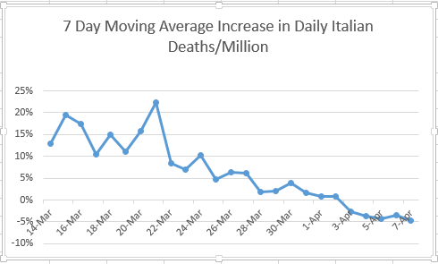
would have led to a doubling in the number of daily deaths every 3-4 days. It has now declined to (-5%). This means that not only is the rate of increase slowing, but the number of daily deaths has also started to decline, from a peak of 919 on 3/27 to 604 on 4/7.
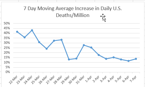
The U.S. graph of the same measure (below) shows that, though our rate of increase has slowed from almost 45% to just under 15%, we have yet to slow the rise in daily deaths.
I believe one of the principal reasons for the 18% rise in the S&P 500 since March 23rd is not the unfathomable “stimulus” measures which have come out of Washington (most of which will probably do more harm than good), but the market’s belief that the U.S. will soon follow Italy’s downward path, which will lead to a gradual resumption of productive economic activity.
Extraordinary Data – As I mentioned at the start, I’ve done quite a bit of reading on the pandemic, but yesterday a client alerted me to what I think is a real game-changer in our fight to balance protecting people’s lives and their jobs. It’s a thermometer manufactured by Kinsa:
The San Francisco-based health technology company was launched in 2012 to help stop the spread of infectious illness — in particular, the seasonal flu — through earlier detection and earlier response.
Their means? An internet-connected smart thermometer, paired to a mobile app, which aggregates consumers’ temperature and symptoms data This real-time data enables Kinsa to track where in the U.S. the illnesses start, so the health industry can be better prepared to mobilize the right resources in the right places at the right times.
Now, Kinsa says, the data gathered from its smart thermometer could help to predict future COVID-19 outbreaks by relying on the data it has collected for years to determine what the U.S. can expect from a normal cold and flu season. The model takes what is currently being seen — a spike in illness — and subtracts the “norm.” What they’re left with is an anomaly, which can be correlated to coronavirus.
Kinsa currently has thermometers in more than a million households. More than 2 million users nationwide record about 150,000 temperature readings per day. Thermometers cost about $40 for a standard model and about $70 for an ear model. The thermometers connect to a smartphone via Bluetooth, uploading location,
temperatures and user-inputted symptoms to Kinsa’s database. The result is a trove of information for the company to then mine for patterns.[2]
Their website[3] features a nationwide, county by county map that shows the number
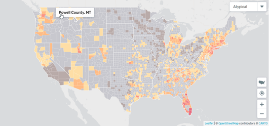
of daily fevers at any location, and how that compares to the same time in previous years. All of these fevers at the moment do not come from COVID-19 – many are from regular flu and various bacterial infections – but by comparing current data to previous years, it is possible to extrapolate the number of probable COVID cases that may require medical care. (It will not give you the total number of cases because many are asymptomatic.)
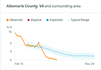
Why might this data be so extraordinarily useful?[4] Let’s start with a chart from my home, Anne Arundel County, Md.:
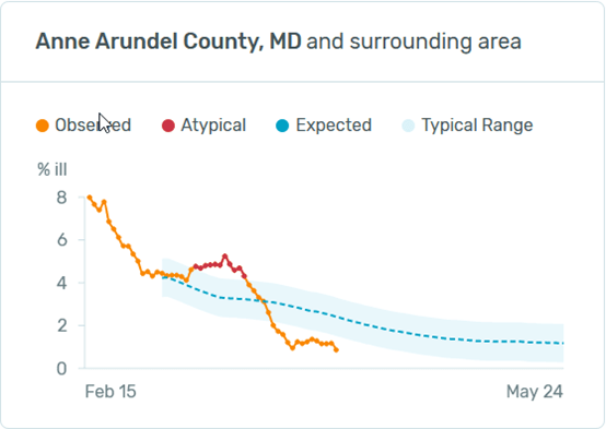
“Observed” is the number of reported fevers from the county as a % of the county’s population. The “Typical Range” is the range that Kinsa has observed at these points in time from this location in previous years. “Atypical” means that the number of fevers on this day is outside the normal range, the implication being that most of this is due to the Coronavirus. The atypical period for A.A. County was from 3/9 to 3/19.
Most of the county charts that I have had time to review look similar to A.A.: atypical cases jumping in March, declining to a current level way below what would be expected at this time of year.
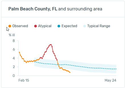
The areas with the most atypical fevers that I can find are in South Florida, represented here by Palm Beach County:
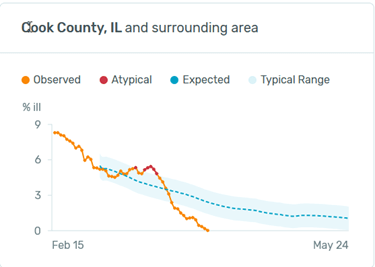
Most rural counties show no atypical fevers at all. What about N.Y. and Washington State? Here are the graphs from the two most atypical locations:
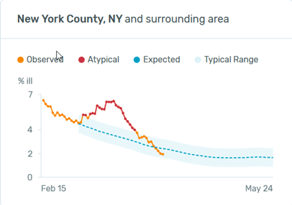
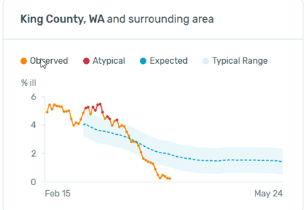
N.Y. is about what you would expect from reading the headlines: a large spike that has now receded to the lower end of typical. Washington doesn’t look all that different from Anne Arundel.
What are the extraordinary implications of these numbers?
- First, and this is actually to be expected: social distancing has had a profound effect. Almost all the charts that I have reviewed show current levels below the expected range. This means that fevers from all illnesses have decreased, most likely because social distancing has decreased the spread of the coronavirus and the seasonal flu. My guess is that if this type of data had been available for the last 100 years, you would be unable to find any other period like it.
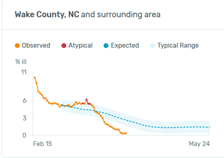
- It is my belief that what has driven the socializing restrictions under which we now suffer is a very legitimate fear of overwhelming our capacity to treat the infected. It has not been simply a concern over the number of deaths. If that were the case, we would have long ago been forced to wear R95 masks each winter in order to lessen the tens of thousands of deaths we suffer from the seasonal flu. In reviewing these county charts, it seems that many counties had an experience similar to Wake County, N.C. On February 15th their fever rate of 10% was not atypical, and their highest rate of 6% on March 16th was well below what would normally be a high end number for them in the winter. This implies that unless their cases spiked significantly (which may have happened without social distancing) their treatment capacity was not going to be strained. Because we do not currently have a vaccine, and because social distancing has prevented us from developing “herd immunity,” when the restrictions are relaxed, it is inevitable that we will see an upturn in cases. These numbers that Kinsa is providing should be instrumental in directing resources to areas that are likely to have infections that will overburden them.
- Almost all areas in the U.S. have now adopted a similar social distancing policy: closing schools and all “non-essential” businesses, inhibiting contact between unrelated individuals, and strongly encouraging hand washing and masks. However, these policies were not all adopted on the same day. It will be interesting to see if this data can be used to determine the efficacy of these actions by comparing the rate of fever spread between jurisdictions with various adoption dates. The multi trillion dollar question is not whether these policies have slowed the spread of the disease; of course they have. The argument which we are now having, and which I believe will soon intensify to a level eclipsing every public policy debate in this country since the Vietnam War, is whether we have gone about this in a way that properly balances physical and financial health.
Don Harrison, 4/8/20
The information contained in this report does not purport to be a complete description of the securities, markets, or developments referred to in this material. The information has been obtained from sources considered to be reliable, but we do not guarantee that the foregoing material is accurate or complete. Any opinions are those of Don Harrison, and not necessarily those of Raymond James. Expressions of opinion are as of this date and are subject to change without notice. There is no guarantee that these statements, opinions or forecasts provided herein will prove to be correct. Investing involves risk and you may incur a profit or loss regardless of strategy selected. Keep in mind that individuals cannot invest directly in any index, and index performance does not include transaction costs or other fees, which will affect actual investment performance. Individual investor’s results will vary. Past performance does not guarantee future results. Future investment performance cannot be guaranteed, investment yields will fluctuate with market conditions. The S&P 500 is an unmanaged index of 500 widely held stocks that is generally considered representative of the U.S. stock market. Forward looking data is subject to change at any time and there is no assurance that projections will be realized. All investments are subject to risk.
[1] All graphs, unless otherwise noted, created from numbers at https://www.worldometers.info/coronavirus/
[2] https://www.cnbc.com/2020/04/02/this-smart-thermometer-could-help-detect-covid-19-hot-spots.html
[3] https://healthweather.us/?mode=Atypical
[4] To be transparent, let me add a disclaimer: 1) I am assuming that Kinsa’s fever percentages are a representation of fevers as a percentage of population, and that they have been extrapolated from samples that are significantly large enough to be meaningful. 2) I am also assuming that fever is highly significant symptom in COVID cases that are likely to need medical care.
