
Were the Lockdowns Necessary? And a Few Other Trivial Things
I’ll get to the above question – which has the nation boiling – at the end, but first a bit of levity, a look at what the latest data is saying about my Alien Fish, and an introduction to a new way to determine if the disease incidence is declining.
Laughter Is Pretty Good Medicine
Before I get into statistics and arguments, watch this video.
Sometimes 3 minutes of pointed humor is worth a month of analysis and pontification. I would hope that anyone can laugh at this, whether they think we never should have been locked down, or believe the stay-at-home orders should last until the end of the year.
Others Catch Alien Fish
When I analyzed Kinsa’s fever data a couple weeks ago (In Search of Alien Fish)[1]I came to 4 conclusions:
- The disease entered the U.S. much earlier than generally acknowledged, perhaps in early December.
- Up until early March, its incidence was hidden among seasonal flu cases.
- It has a large number of asymptomatic cases.
- By simple extrapolation, if we know the number of deaths, and the actual number of cases is larger than the confirmed numbers, than the lethality rate is much lower than originally indicated.
I was the only one that I am aware of who was looking at the Kinsa website and coming to these conclusions. Since then, new information has emerged that supports my hypothesis.
CDC Data Catches Alien Fish — In a national publication in which my research was noted,[2] Dr. Johnathan Geach also cites another study that uses the CDC’s ILI (Influenza-like Illness) numbers to reach an estimate of 8.7 million COVID cases between 3/8 and 3/28:
By quantifying the number of excess ILI patients in March relative to previous years and comparing excess ILI to confirmed COVID case counts, we estimate the syndromic case detection rate of SARS-CoV-2 in the US to be less than 13%. If only 1/3 of patients infected with SARS-CoV-2 sought care, the ILI surge would correspond to more than 8.7 million new SARS-CoV-2 infections across the US during the three week period from March 8 to March 28.[3] (Emphasis mine)
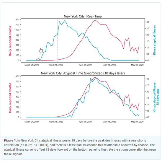
Kinsa Fevers Signal Future Deaths — This analysis supports my contention that the spike in fevers in early March was the first evidence that we had of a rising number of unacknowledged COVID cases. In addition, KINSA has shown that there is a very strong correlation between atypical fevers and coronavirus deaths. In New York City, there has been an almost perfect 18 day lag between fever incidence and deaths[4].
Widespread Infections — We have also had 7 tests of randomly selected populations which looked for antibodies for COVID-19.[5] The presence of antibodies indicates that the person has been infected at some point in time, even if the disease is no longer active. Here are the results of those tests:
Extrapolating this percentage nationwide gives you around 31 million coronavirus infections. Why is this so much higher than the ILI numbers? The ILI estimate is only for a 3-week period in March. If this illness entered the U.S. in early December as I suspect, than 31 million cases does not seem that startling. Is this an exact figure? Absolutely not. As you can see, the incidence of infection for each area ranges from 4% to 32%, which is an awfully large variance. We will need more antibody testing in more areas to come up with a more accurate picture, but all of these tests indicate an infection level much higher than generally acknowledged, which means a large number of asymptomatic cases.
What is the percentage of asymptomatic cases? None of the publications that detail the tests cited above give the asymptomatic incidence, except for Miami. However, there are tests that have been done in prisons, nursing homes and aboard ships[6]. Here are their numbers, along with Miami’s:
The number of asymptomatic cases ranges from 50-100%, with an average of 89%. I don’t know if the number is actually this high; there seems to be something very strange going on among locked-in populations. Perhaps it depends on how “asymptomatic” was determined, if it was done by asking a question like “have you felt sick in the last two months?” Homeless people might feel bad all the time and have less awareness of when they are truly ill. Prison inmates might be too toughened to admit they were under the weather. But that doesn’t explain the cruise ship numbers. Once again, more random samples are needed, but even if the national asymptomatic percentage is a bit less than Miami’s 50%, there are still a significant number of asymptomatic cases.
Bottom line: the CDC’s ILI data, Kinsa’s own research, and a number of randomly-sampled tests have confirmed what I deduced from the Kinsa fever numbers three weeks ago: the disease entered the U.S. earlier than expected, there are a large number of asymptomatic cases, and by simple extrapolation, the true mortality rate is orders-of-magnitude lower than what most experts originally believed.
Less Juice for the Squeeze
I cautioned a month ago that increases in the daily number of confirmed cases were an almost useless statistic for determining the spread of the disease because, as we tested more people, we would naturally get an increase in new cases. At the time, using deaths as an indicator of COVID prevalence made more sense. That reasoning has now been turned upside down. Because the CDC has changed the definition of “dying from COVID,” the mortality statistics have become less reliable. More importantly, however, the number of confirmed cases has now become a much more trustworthy tool for estimating prevalence.
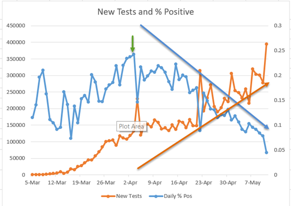
Why is that? The number of daily tests first reached 200,000 on April 4th, as you can see from the chart below (left scale, brown line)[7]. Since April 22nd, tests have averaged 258,000 a day. The percentage of positive tests peaked on April 3rd at 24% (right scale, blue line), and since then has been steadily declining to the point where it is now around 4% (5/11). What does this mean? It is getting harder and harder to find coronavirus infections among people who have symptoms. This is a good indication that the number of total infections is declining nationwide. I believe that all states should be publishing these numbers, and using them as a guide to ease their lockdowns.
As an aside, one question that I have regarding tests and positive cases is this: what is wrong with all the people who are getting tested but are negative for COVID-19? On May 11th, roughly 375,000 of the people tested did not test positive. What kind of symptoms did they have that would lead a doctor to recommend a test? (These are not random tests.) As you will see from the charts in the next section, this country currently has a statistically insignificant number of fevers. When it comes to overall viral and bacterial infections, we have probably never been healthier. I know it’s hay fever season; are doctors testing people who have allergies? My wife and I both have a pretty average case of what we always have in the spring when the cars turn green: a bit of sneezing, some coughing and a lot of post-nasal drip. But we’re not calling the doc! I hope someone can enlighten me on this.
Were the Lockdowns Necessary?
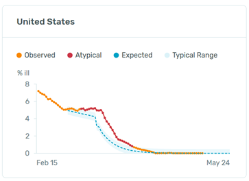
Reading this question, you might be thinking, “Harrison, are you crazy? Look at the Kinsa fever charts you’ve been using.[8] They all show a dramatic drop in overall fevers, which by your reasoning means that deaths from COVID have been reduced by the lockdowns. We would have many more fevers and deaths if it were not for the lockdowns!”
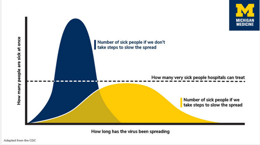
Perhaps. Remember, however, that the original and primary reason for the stay-at-home orders was to “flatten the curve”[9] to keep hospitals from being overwhelmed by the very ill. This was undoubtedly a worthy goal, but it was generally assumed that, in the long run, absent a vaccine or effective medications to mitigate the disease life-threatening symptoms, overall deaths would total roughly the same no matter the degree of social distancing. Managing the illness was the goal, not preventing total deaths. (If you feel that our elected officials and medical authorities were heartless to relegate the prevention of deaths to secondary status, consider that we have had between 10,000 and 60,000 annual deaths from the seasonal flu in each of the last 10 years. These are significant numbers, but no one has ever proposed that we fight the flu with what we are now enduring.)
The real question then is whether the lockdowns were necessary to keep the medical system from being overwhelmed. I have no expertise whatsoever when it comes to managing hospitals, so I am certainly not going to attempt a definitive answer on this.
I do think, however, that the data strongly suggests avenues of inquiry that need to be explored.
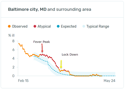
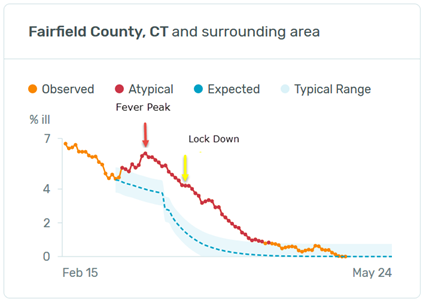
Stay-at-Home Timing — A good place to start is to compare the peak in fevers in each state with the timing of school closures and stay-at-home orders. Below is a chart for each state showing the date when fevers peaked, when schools were shuttered and when citizens were ordered to shelter in place. [10] N/A means no order of that type was given. “None” in Minnesota and Wisconsin means that there was no spike in fevers; fevers there seem to have ebbed with the end of the flu season with no COVID bump.
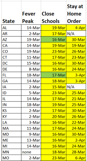
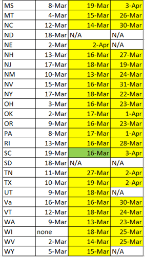
A green box means the social distancing order was given before the peak in fevers, while a yellow box indicates it was given after the peak. 47 states closed schools; only 3 of these closures were done before fevers peaked. Every state that closed non-essential businesses and issued stay-at-home orders did so after fevers peaked in that state. The average time lag between school closure and fever peak was 8 days; between the ultimate lockdown and fever peak it was 17 days. Is it possible to find any correlation between the government edicts and the decline in fevers?
School Closures: At first glance, Michigan and Pennsylvania suggest that school closures may have had an effect on the decline in fevers.[11] A total of 19 states show something similar. But I’m probably being very generous when I say these 19 charts seem to indicate that school closures may have had a positive effect. In most cases, the decline began 1-3 days after the school closings. I’m not an expert on the time
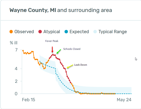
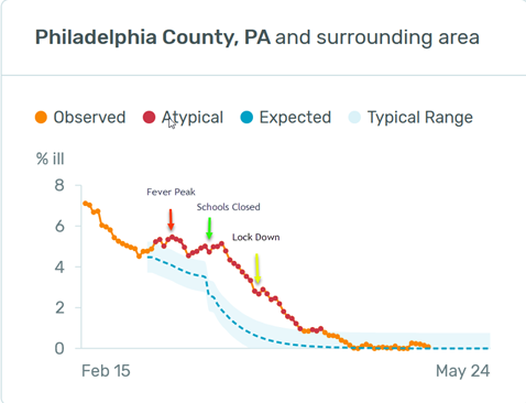
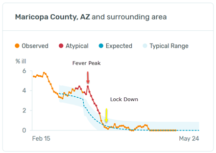
it takes for social distancing to have an effect in reducing disease incidence, but I doubt if the effect ripples through a general population in just a few days. In addition, when we look at the 11 states that had at least a 13 day lag between peak fevers and school closings (states that were sometimes harshly criticized for dithering about), we see that there was almost no rise in fevers – or even a plateauing — because these states took so long to close schools. Of the 11, only Arizona and Ohio hint at an effect from school closings. The rest look like Tennessee and Oklahoma. Fevers were already in free fall when schools were shut down.
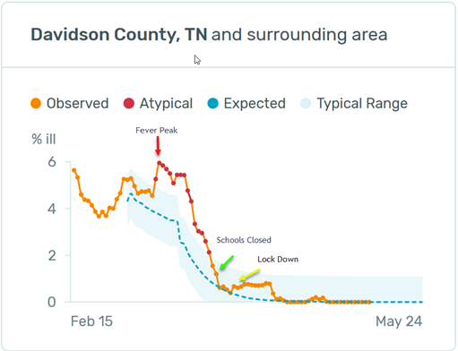
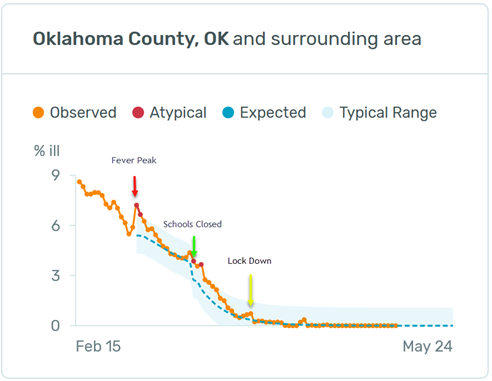
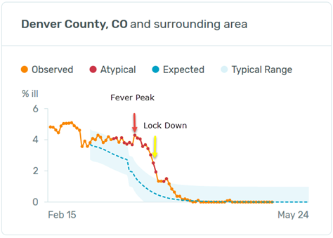
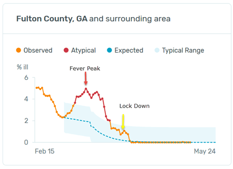
Lock Downs — Since there was not a single instance where government locked a state down before the peak in fevers, you have probably already deduced that these actions probably had little effect. Colorado closed all businesses 7 days after their fever peak. Georgia shut down 20 days after theirs. Fevers in both states declined in a very similar fashion.
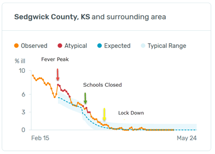
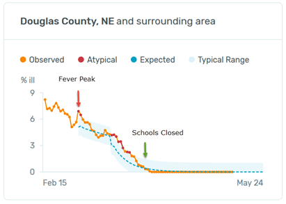
You can go to the Kinsa website and use my chart to look at these dates for all states and you will find essentially the same pattern. Here are a couple more examples:
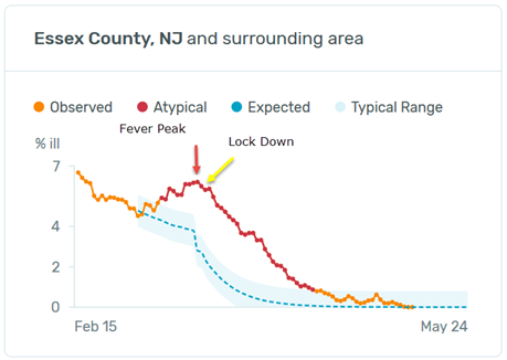
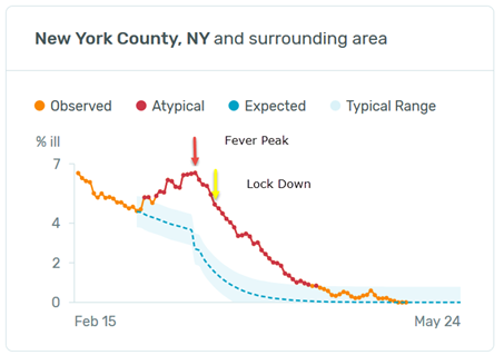
What about New Jersey and New York? They shut down 2 days and 5 days, respectively, after their fever peaks on 3/17, which was faster than almost all other states, and their fevers declined dramatically right after that. Didn’t their lockdowns have a positive effect? Perhaps, but neighboring Connecticut did not shutter until 3/23, 12 days after its fever peak, and had similar results to the Garden and Empire states.
Connecticut’s fevers began to rise on 2/29 and went from 4.64% of the population to 6.11% on 3/11. New York and New Jersey’s rise began on 3/2 and rose from 4.62% to 6.54% and from 4.53% to 6.21%, respectively. All three states subsequently hit negligible fever levels around the third week in April.
Kansas and Nebraska, two adjoining rural states with a couple medium sized cities each, took different approaches. Kansas closed schools and locked down. Nebraska closed schools but did not lock down. Fevers peaked in both states on March 2nd and bottomed out in early April. As of 5/10/20, Kansas has had 60 deaths/million population while Nebraska has had 51. Iowa and Arkansas, two similar states which instituted no lockdowns, have had 86 and 30 deaths/million respectively.[12] It certainly appears that Kansas’ shut down had no effect.
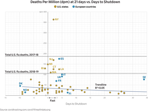
Higher Math — T.J. Rogers, founding CEO of Cypress Semiconductor, has come to a similar conclusion using a different approach.[13] (I urge you to read the whole article.)
To normalize for an unambiguous comparison of deaths between states at the midpoint of an epidemic, we counted deaths per million population for a fixed 21-day period, measured from when the death rate first hit 1 per million—e.g.,‒three deaths in Iowa or 19 in New York state. A state’s “days to shutdown” was the time after a state crossed the 1 per million threshold until it ordered businesses shut down.
We ran a simple one-variable correlation of deaths per million and days to shutdown, which ranged from minus-10 days (some states shut down before any sign of Covid-19) to 35 days for South Dakota, one of seven states with limited or no shutdown. The correlation coefficient was 5.5%—so low that the engineers I used to employ would have summarized it as “no correlation” and moved on to find the real cause of the problem.
No conclusions can be drawn about the states that sheltered quickly, because their death rates ran the full gamut, from 20 per million in Oregon to 360 in New York. This wide variation means that other variables—like population density or subway use—were more important. Our correlation coefficient for per-capita death rates vs. the population density was 44%. That suggests New York City might have benefited from its shutdown—but blindly copying New York’s policies in places with low Covid-19 death rates, such as my native Wisconsin, doesn’t make sense.
His analysis of death rates and shutdowns showed a similar result to my interpretation of the fever data: the most draconian social distancing dictates probably had little effect on deaths in most places.
How is that possible? An Israeli researcher insists that the virus appears to have followed a similar path in disparate locations, such as Sweden, Singapore and Taiwan, which did not lock down: it rose to a peak about 40 days into its spread and petered out after around 70 days.[14] He could not explain the phenomenon, thinking it might be related to climate or the virus’ innate life cycle. I have a simpler explanation: people aren’t stupid. Self-interest is the 2nd most powerful force in the history of human affairs (shared self-interest being numero uno). Though college students crowding onto the Florida beaches during spring break, and then bringing the virus back to their hometowns, became the poster boys and girls for ignorant America’s response to the disease, I believe 99% of us were smarter than that. Even before any schools were closed or businesses shuttered, we were waving instead of shaking hands, staying out of each other’s faces, and washing our hands repeatedly. I eat breakfast every Saturday with a bunch of geezers. We usually sit shoulder to shoulder at one table; weeks before Governor Hogan closed down Md., we had moved to two tables and were keeping a respectful distance.
Back to the Original Question – Were the lockdowns necessary to keep hospitals from being overwhelmed? Since the fever data and T.J. Rogers research suggest that they did little to reduce illness, the answer is probably “no” for the overwhelming majority of locations.
Here’s a final way of looking at the question. According to the CDC[15], between the beginning of the year and March 10th, we had roughly 440,000 hospitalizations for seasonal flu, which works out to an average of 6,200 per day.
Preliminary Cumulative Estimates of Hospitalizations in the U.S. 2019-2020 Flu Season
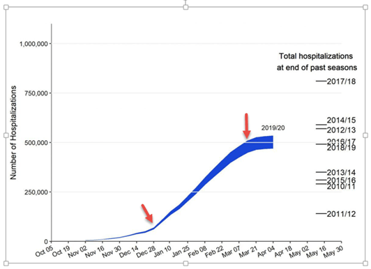
As the flu season was waning in early March, COVID hospitalizations were just beginning to pick up. Between March 21st and May 10th, they totaled 144,780, or roughly 2,900 per day. This suggests that in most areas hospital capacity was more than adequate to meet the coronavirus burden.
The Speaker of the House in Pennsylvania, Mike Turzai, in a letter to his fellow representatives, came to a similar conclusion for his state:
According to the Hospital and Health System Association of Pennsylvania (HAP), citing Pennsylvania Department of Health statistics, there are 37,000 beds in Pennsylvania hospitals. As of today, 2,572 of these beds were occupied by Covid-19 patients, which amounts to 6.95%
Once again, since I am not an authority on hospital management, I can’t say this definitively, but I think it would be helpful for the nation to see accurate numbers comparing hospital capacity to the actual COVID burden for all hospitals.
Bottom line: Looked at from a number of different angles, there is a good chance that the near-total lockdowns that most states have imposed did little to slow the spread of the disease and prevent hospitals from being overwhelmed. We are going to have to learn to live “around” this disease until an effective vaccine is formulated, and we need to be able to pursue this kind of inquiry in an objective and unemotional manner to effectively balance our dual needs of safety and economic survival.
Watch This Map Going Forward
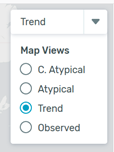
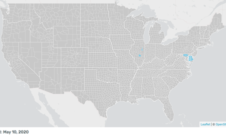
We are all anxious to see if the disease reasserts itself as states open back up. One of the best ways for you to keep tabs on this is to use the Kinsa fever map. Go here. Hit “Trend” in the drop down in the upper right hand corner.
You will see a map that looks something like this:
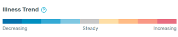
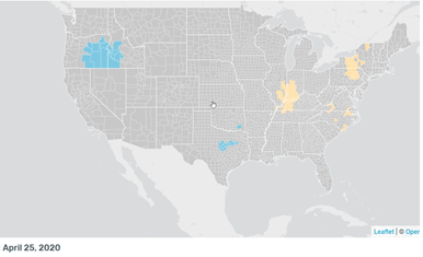
Blue indicates decreasing fevers, grey means fevers are steady, and tan to red signals various degrees of increasing fevers. Don’t be alarmed by scattered,occasional tan flare-ups. All the incidences of increase that you see on this map from 4/25 faded away without any dramatic consequences.
Here is the map from 5/10. All quiet pretty much everywhere.
Don Harrison
The information contained in this report does not purport to be a complete description of the securities, markets, or developments referred to in this material. The information has been obtained from sources considered to be reliable, but we do not guarantee that the foregoing material is accurate or complete. Any opinions are those of Don Harrison, and not necessarily those of Raymond James. Expressions of opinion are as of this date and are subject to change without notice. There is no guarantee that these statements, opinions or forecasts provided herein will prove to be correct. Investing involves risk and you may incur a profit or loss regardless of strategy selected. Keep in mind that individuals cannot invest directly in any index, and index performance does not include transaction costs or other fees, which will affect actual investment performance. Individual investor’s results will vary. Past performance does not guarantee future results. Future investment performance cannot be guaranteed, investment yields will fluctuate with market conditions. The S&P 500 is an unmanaged index of 500 widely held stocks that is generally considered representative of the U.S. stock market. Forward looking data is subject to change at any time and there is no assurance that projections will be realized. All investments are subject to risk.
[1] http://capitalistinvestment.com/blog/
[2] I’m the “enterprising financial analyst” https://spectator.org/mapping-the-mortality-maze-how-deadly-is-covid-19/
[3] https://www.medrxiv.org/content/10.1101/2020.04.01.20050542v3 Dr. Geach’s article says 28 million COVID cases, but this was a typo that should be corrected.
[4] https://www.kinsahealth.co/kinsas-illness-signal-a-leading-indicator-covid-19-outbreaks/
[5] https://www.latimes.com/california/story/2020-04-20/coronavirus-serology-testing-la-county, https://www.nytimes.com/2020/04/23/nyregion/coronavirus-antibodies-test-ny.html, https://www.powerlineblog.com/archives/2020/04/an-update-from-dr-b.php, https://www.bccourier.com/these-are-the-first-lessons-of-the-heinsberg-study/, https://www.thenational.ae/world/germany-s-wuhan-has-15-per-cent-infection-rate-and-low-death-toll-1.1004050, https://www.medrxiv.org/content/10.1101/2020.04.18.20071134v1.full.pdf, I have left out the tests done in prisons, nursing homes and aboard ships because these close quarters do not replicate the experiences of the general population.
[6] https://www.nature.com/articles/d41586-020-00885-w; https://www.reuters.com/article/us-health-coronavirus-prisons-testing-in/in-four-u-s-state-prisons-nearly-3300-inmates-test-positive-for-coronavirus-96-without-symptoms-idUSKCN2270RX; https://www.boston25news.com/news/cdc-reviewing-stunning-universal-testing-results-boston-homeless-shelter/Z253TFBO6RG4HCUAARBO4YWO64/
[7] This chart constructed from data available at https://covidtracking.com/data/us-daily
[8] https://healthweather.us/?mode=C.+Atypical
[10] Fever peak data is from https://healthweather.us/?mode=C.+Atypical and the dates for government closures are from https://www.worldometers.info/coronavirus/country/us/
[11] All fever charts and data from https://healthweather.us/?mode=C.+Atypical
[12] https://www.worldometers.info/coronavirus/country/us/
[15] https://www.cdc.gov/flu/about/burden/preliminary-in-season-estimates.htm
